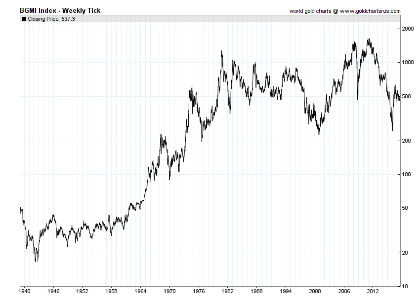
Above is a chart of the Barrons Gold Mining Index, the oldest mining index available.
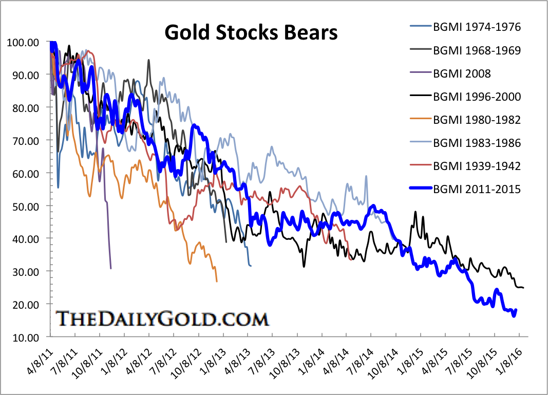
Above are chart analogs of past bear markets in gold-mining stocks. Rather than using charts to PREDICT the next “Head and Shoulders Bottom” or the next ROUNDING BOTTOM (How about I show you MY bottom?) what can charts tell you about this PARTICULAR industry? How is that information useful? Or is it?
Note the hedged comments of the publisher of the above charts. https://www.bullionvault.com/gold-news/gold-bear-010420161
Charts have never shown (based on my research) to have any statistical predictive value because of the subjective nature of interpretation–there are always two sides to a chart. Buffett stopped charting when he could flip the chart over and get the same answer. Note this article https://seekingalpha.com/article/82372-adventures-in-technical-analysis-jim-cramer-edition
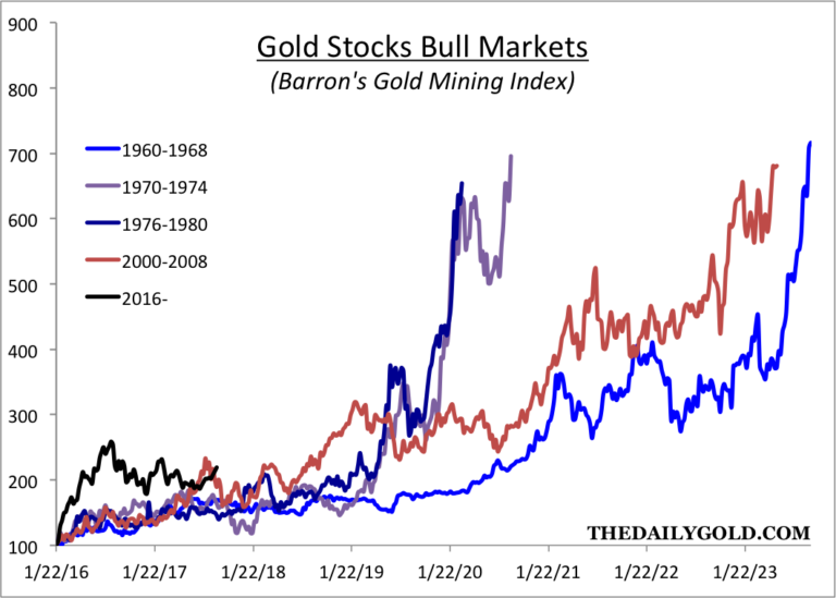
Now onto the bull market analogs.
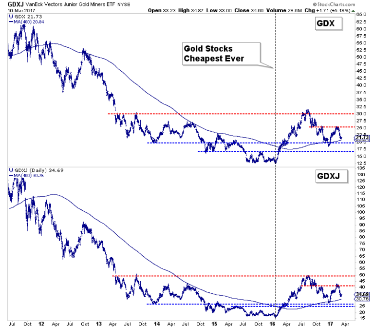
Notice the difference with these charts of housing and banks.
What might account for the difference in the chart patterns? What do the charts tell you about the mining industry? IF–god forbid–you did wish to invest in precious metals miners, how might you adapt your strategy? What explains (mostly) the shape of the above charts? It is perfectly rational to avoid the industry but what do the charts tell you about the structure of the industry? Whip out your competitive analysis books or http://mskousen.com/economics-books/the-structure-of-production/ and post your thoughts.


14 responses to “Charts: Every Picture Tells a Story Don’t It? –Rolling Stones”