As a general rule….people ask for advice only in order not to follow it; or, if they do follow it, in order to have someone to blame for giving it. –Alexandre Dumas
This l o n g post is critical in understanding our current investing environment. I copied the entire post from www.acting-man.com because of its importance. Value investors seek bargains. We look at the particular shoe, car, asset, or business and seek to buy below what we estimate it to be worth. Outguessing the market or the economy is a hopeless task, nevertheless, one must be aware of distortions in order to normalize earnings–how would you have normalized earnings for housing stocks in 2005 and 2006, at the peak of a massive distortion? Currently, we are making economic history with the current distortion of the country’s production structure.
Be aware of what that means for your investments! Read on.
Summary: Since this is a long post, let’s cut to the quick. If interest rates are pushed below their natural free market rate (our time preference or how much do we consume today vs. save for tomorrow), then businessmen are fooled by how much real savings are in the economy to utilize or bid for. Say with a 5% loan we see in our spread sheets that building a factory would generate a nice profit, so we begin building our three-story building, but since there are not enough real savings in terms of bricks, steel, cement, as we build, the prices of those materials begin to rise. Now our building is no longer profitable because our input costs have risen or worse–there are no more bricks available to complete our factory. We abandon the project halfway through. Look at the empty and uncompleted housing complexes outside of Las Vegas from the busting of the housing bubble in 2005/06 as a recent example.
Background: Structure_Production_Reconsidered (a full review after you have finished this post). For the fanatical student: Economic Depression Their Cause and Cure
The Goldilocks Illusion May 11, 2015 | Author Pater Tenebrarum
Why Market Participants Liked the Payrolls Report
Some people have wondered why the stock market reacted with such a big rally to last Friday’s payrolls data. After all, the report wasn’t much to write home about, especially if one ponders the details. In addition, the already weak March payrolls data were revised lower to an even worse figure.
However, the report certainly did one thing: it kept the “Goldilocks illusion” alive. While jobs data are a lagging economic indicator and would likely be completely ignored in an unhampered free market (if anyone even took the trouble to collect them, that is), they are regarded as decisive for Fed policy. Few things illustrate more vividly that the central planners are driving forward with their eyes firmly fixed on the rear-view mirror.
The Fed has little choice though, since its mandate explicitly includes employment as one the things central bank policy is supposed to support (which it does mainly by fostering artificial booms and malinvestment of capital). The market’s focus on the jobs data has increased greatly in recent years as a result of this, which incidentally illustrates how utterly dependent the markets have become on a continuation of easy money policies by central banks.
The “Goldilocks” idea is that it is best for risk assets if economic data are strong enough not to signal recessionary conditions, but weak enough to keep ZIRP and monetary pumping going. Friday’s data point was presumably considered almost perfect in terms of this playbook.
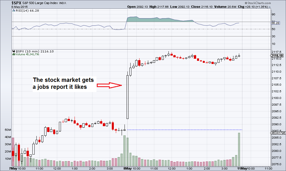
SPX, 10 minute chart: stocks bounce back to the upper end of their recent range
Normally the stock market is held to reflect the past successes or failures of listed companies, as well as expectations about their future performance. To some extent this is still the case, but as the market has come to increasingly depend on monetary pumping and the associated perceptions, this factor has diminished in importance.
We can indirectly discern this from certain data points, such as the fact that the median stock has never been more expensive than today. This is a sign that intra-market correlations have greatly increased. However, it is actually impossible for such a large percentage of listed companies to be equally successful in terms of real wealth creation. Along similar lines, the strong rise in the Q-ratio (it is currently two standard deviations above the mean) is a strong sign that market valuations are driven by the “money illusion” rather than a rational assessment of value.
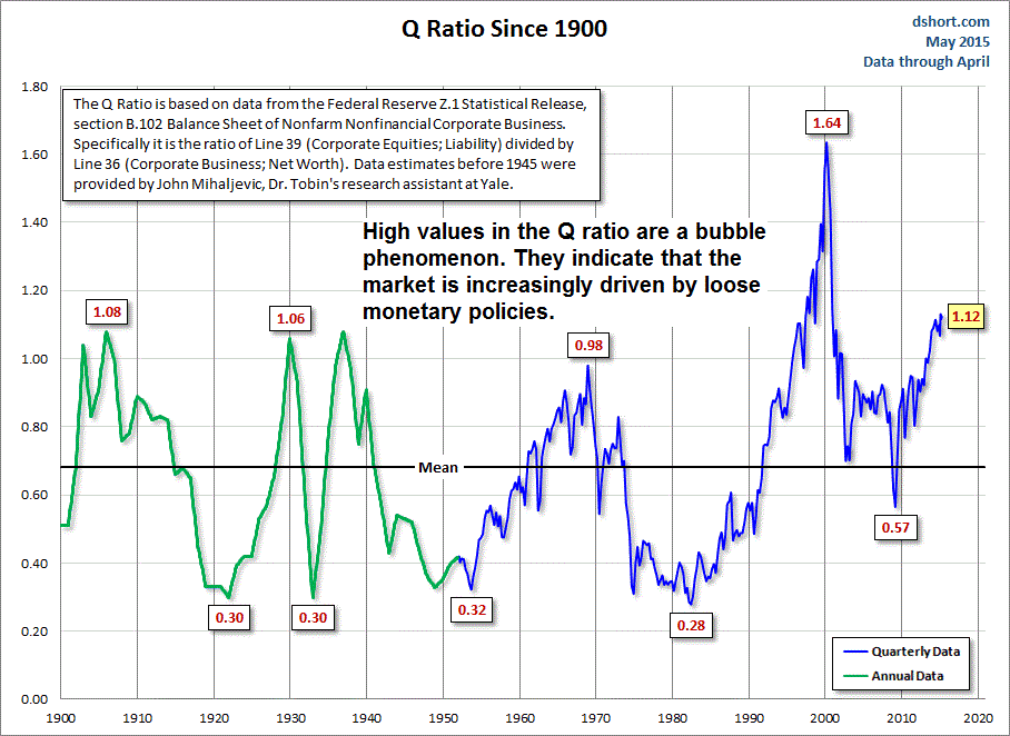
A long-term chart of the Q ratio shows that loose monetary policy frequently distorts market valuations. If it tops out near its current level, it will be the second highest peak in history – click to enlarge.
What Will Shatter the Illusion?
Not everybody thinks that the “not too hot, not too cold” jobs data will keep the Fed from going through with its long-announced “policy normalization” plans. However, the conviction is growing that this will once again be pushed back to a later date. Here is an excerpt from a Bloomberg report on the payrolls report that illustrates the current consensus on the topic:
“U.S. job growth rebounded last month and the unemployment rate dropped to a near seven-year low of 5.4 percent, suggesting underlying strength in the economy at the start of the second quarter that could keep alive prospects for a Federal Reserve rate hike later this year.
Nonfarm payrolls increased 223,000 as gains in services sector and construction jobs offset weakness in mining, the Labor Department said on Friday. The one-tenth of a percentage point decline in the unemployment rate to its lowest level since May 2008 came even as more people piled into the labor market.
However, wage growth was tepid and March payrolls were revised downward, leading financial markets to push back rate hike bets. “We see this report as reducing concerns that weak first-quarter growth represents a loss of economic momentum,” said Michael Gapen, chief U.S. economist at Barclays in New York. Nevertheless, he said the bounce back was not strong enough to think the Fed could bump rates higher before September.
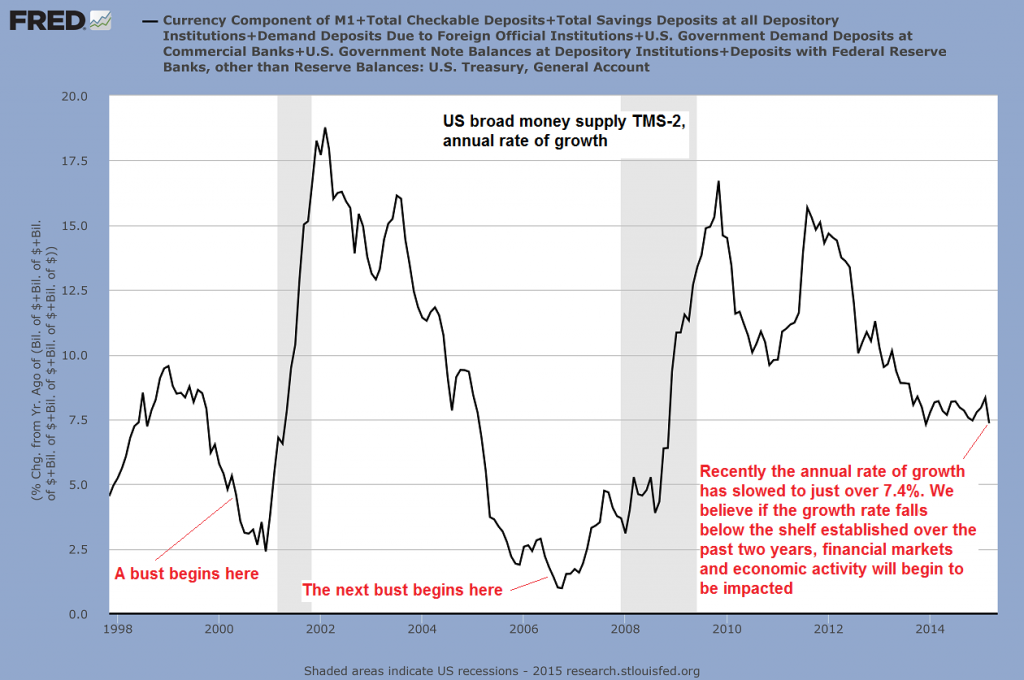
Considering that even most mainstream observers these days are usually admitting to the increasing importance of central bank policy to stock prices, it is slightly baffling that they almost never mention the money supply. The growth momentum of the money supply strikes us as the most important factor determining boom and bust conditions in the economy and the stock market.
As can be seen below, the annual growth rate of the broad US money supply measure TMS-2 (= true money supply) has slowed to approx. 7.4% in March. Historically this growth rate is still quite brisk. It also remains within the “sideways channel” within which annualized money supply growth has oscillated for more than two years. It also remains still well above the previous “bust thresholds” we have indicated on the chart. Therefore it isn’t sending a strong alarm signal just yet.
However, such thresholds are not a fixed magnitude. At what level precisely the boom-bust threshold will turn out to be depends to a large extent on contingent data and market psychology. Our hunch is that this threshold is higher than it used to be, mainly because the economy’s underlying performance continues to be quite weak compared to previous post WW2 era recoveries.
Money supply TMS-2, annual rate of growth
How much monetary pumping is required to keep assorted bubble activities on life support is unknowable. However, we can be sure that the economy is becoming ever more imbalanced and structurally weaker the longer strong monetary pumping continues. This is another reason to suspect that the “bust threshold” is likely higher than it used to be. Moreover, the lagged effect on economic activity from the peak money supply growth rates recorded in late 2009 and late 2011 has to be diminishing by now. As newly created money continues to ripple outward from its points of entry into the economy, the likelihood that “bad effects” become visible increases.
Currently there are two firmly established consensus opinions that are based on the irrational faith that this time, central bankers somehow know what they are doing. One is the idea that strong economic growth is “just around the corner”, where it has been suspected to be lying in wait for the past six years. A corollary to this is the belief that the economy cannot possibly weaken to the point of entering an official recession.
A second, related conviction is that no “inflation problem” can possibly appear on the scene. Inflation problem in this case means: a noticeable increase in CPI. There are many good reasons for this consensus opinion. A number of contingent trends are helping to keep consumer prices in check. They comprise large consumer debt overhangs in nearly all developed countries, negative demographic trends, subdued wage growth (due to global labor arbitrage and tepid economic activity) and ongoing productivity growth in manufacturing (which seem to be waning lately). Moreover, in the post 2008 era, newly created money hasn’t primarily been borrowed into existence due to growing credit demand in the real economy. Instead it has entered financial markets more or less directly, as central bank debt monetization leaves major market participants with first dibs on new money.
All these trends affect demand for consumer goods, and even though we cannot truly measure their impact, some empirical confirmation is provided by related data points such as weak growth rate in retail sales. However, the demand side is only one part of the equation. Years of monetary pumping have left their mark on the economy’s production structure (KEY POINT!), and we want to briefly look at the problem from this angle.
The Balance between Production and Consumption
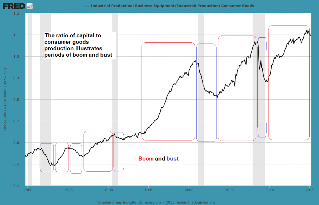
The chart below shows the industrial production index for capital goods (business equipment) compared to the production indexes of consumer goods and non-durable consumer goods. Given extensive global trade, domestic US consumer goods production has been partly replaced by imports, but the history of these indexes still conveys useful information.
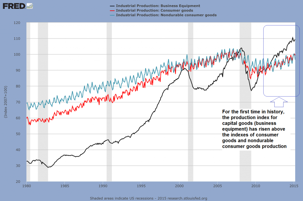
Industrial production: capital goods vs. consumer goods and consumer non-durables
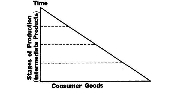
When interest rates decline, long-term projects that yield a consumable output only after a long period of time appear to become increasingly profitable. The decisive factors are firstly that the profitability hurdle declines as interest rates fall (for instance, it makes no sense to borrow capital at 4% for an investment yielding only 3%, but the situation obviously changes if borrowing costs decline to 2%), and secondly, that the net present value of long-lived capital goods increases sharply when they are discounted at a lower interest rate. The longer the time period involved, the bigger the effect will be.
As a result, factors of production will increasingly be bid away from the lower stages of the production structure (those closer to the consumer) to the higher stages (capital goods production) and the economy will become more capital intensive. In an unhampered free market economy, this is generally a positive development indicating a progressing economy. A decline in interest rates will signal that people are increasing their savings. Additional savings are a sine qua non for a sensible lengthening of the capital structure, as new long term investments need to be funded. If people are postponing consumption in favor of saving, this funding will in fact be available.
By increasing their savings, people are signaling that they prefer to be able to consume more or better goods in the future in exchange for lowering their present consumption. The creation of a more capital-intensive production structure will make this possible, as it will lead to greater output of consumer goods in the future (the quantity, and/or the quality of output my increase, and future output may also include goods that could otherwise not be produced at all). Interest rates and prices are the signals indicating to entrepreneurs which types of investments make the most sense and to what extent the time structure of production can be lengthened.
Things become problematic though if interest rates are artificially suppressed by administrative fiat instead of declining due to an increase in savings. Economic calculation is falsified: relative prices are distorted, and the resources required to fund a lengthening of the production structure are in reality not available to the extent indicated by the interest rate signal. The investment activities of entrepreneurs will be misdirected – too much will be invested in the wrong lines, based on an incorrect assessment of consumer wants and the amount of real funding available for long term investment projects. Initially an economic boom is set into motion. Large accounting profits accrue and will be partly paid out in the form of dividends, stock buybacks and higher wages. However, at a later stage it will become obvious that many of these profits were actually illusory and that in reality, capital was consumed.
The people engaged in the production of capital goods need to be able to consume long before their own labor yields goods ready for consumption. They must eat, they need a place to stay, etc. The more factors of production are shifted toward capital goods production and away from consumer goods production, the more likely it becomes that not enough “free capital” in the form of consumer goods is available to support these long-term activities. Obviously, this problem can only be made worse by printing more money. KEY POINT!
The boom eventually expires because it turns out that many new investments can actually not be funded. Once this is recognized, a scramble to obtain the required capital commences, putting upward pressure on market interest rates. The distortions in relative prices that originally fired up the boom begin to reverse and malinvestments are unmasked as unprofitable – the bust begins. By looking at the ratio between capital and consumer goods production indexes, one can clearly discern boom and bust periods:

Not every bust necessarily results in an “official recession”. Sometimes the bust can be concentrated in just a few industries (like e.g. oil production and S&Ls in 1986-1988) – click to enlarge.
Let us reconsider the “CPI inflation” question in light of the above. If too many resources are devoted to capital goods production, the economy will over time tie up too many consumer goods relative to the amount it releases. The economy’s pool of real funding consists of two components: savings and consumer goods that become continually available from ongoing production activities. Although it is well known that many companies these days prefer to engage in financial engineering (mainly in the form of stock buybacks and m&a activities) rather than investing in capital, what counts are relative proportions. If bottlenecks in the supply of consumer goods develop at some point, consumer prices may unexpectedly rise even if the currently tepid level of consumer demand remains unchanged.
The Growing Amplitude of Business Cycles
David Stockman recently posted a chart from a BIS report that shows the amplitude of financial market cycles and business cycles in the real economy:
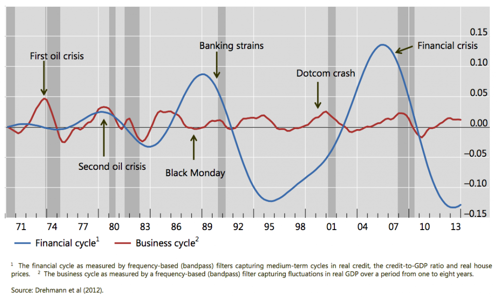
Financial market cycles vs. real economic cycles
This chart illustrates the fact that the increasing activism of central banks in recent years has led to a commensurate increase in the amplitude of business cycles, with boom and busts in asset prices becoming especially pronounced. Since stocks are titles to capital and real estate can be grouped with long-lived capital goods from an analytical perspective, this is in keeping with the distortions in the production structure discussed above.
We have mentioned that the current cycle differs slightly from previous cycles due to the fact that “QE” injects newly created money directly into financial markets. The firms selling securities to the Fed (i.e., the primary dealers) will use the funds they receive to purchase securities again. The sellers of securities in this second round of purchases will largely tend to do the same, and so forth. However, this doesn’t mean that new money will forever stay within the confines of the financial markets in a kind of closed loop. More and more of it will “leak out” over time.
For example, the purchase of expensive trophy properties by the rich generates commissions for real estate agents and profits for real estate developers. Rising stock prices may lead individual investors to sell a part of their investments to increase their consumption. Companies are issuing lots of bonds to take advantage of low rates and seemingly insatiable investor demand. Some of the proceeds are flowing back into the financial markets in the form of stock buybacks, but a large part is used to purchase capital goods, pay wages, invest in R&D, etc. In short, the enlarged money supply eventually ripples through the economy in a variety of ways.
Someone will always have to hold the additional cash balances, and while strong demand for money since the 2008 crisis has so far contributed to keeping consumer price inflation in check, this state of affairs cannot be taken for granted (the demand for money may actually have been egged on a bit by ZIRP as well, as savers of modest means likely feel they have to set aside more money in light of the lack of interest income). We can already see though that those with the largest amounts of cash at their disposal are treating it as a hot potato (hence the frantic bidding for expensive properties, high end art works, etc.).
Conclusion
We can be certain that the vast expansion of the money supply in recent years has once again led to the erection of an unsustainable capital structure. Should money supply growth rates continue to falter, a bust is likely to arrive sooner rather than later, as investment projects that depend on monetary pumping to keep up the appearance of profitability will quickly turn out to have been misguided.
Moreover, the large amount of new money that has been created in recent years continues to move through the economy and the possibility that people will reassess their demand for cash balances cannot be dismissed, in spite of the contingent trends that are currently keeping a lid on consumer demand. This may become especially pertinent if the Fed reacts to the next bust by immediately kicking money supply inflation into high gear again. After all, the strong demand for money is inter alia predicated on the belief that the inflationary policy of recent years isn’t going to continue indefinitely.
Addendum
This article is actually a continuation of the “Echo Boom” articles we have published previously (see here for part 1 and part 2). In the next installment we will look at the relationship between “price inflation” and the stock market. This relationship is not as straightforward as is generally believed.
All in all we can conclude Goldilocks is treading on increasingly thin ice.
Charts by: BIS, St. Louis Federal Reserve Research, StockCharts, Doug Short / Advisorperspectives